How attention to detail can save public money
Are your forms fit for purpose?
Anyone who’s ever filled in a form issued by a public body will know how stressful it can be. Answers have consequences, yet it’s not always clear what information is needed.
Even after reading the notes provided as guidance, applicants can still be left unsure about which sources to reference, which fields are mandatory in their specific case, and whether they also need to provide supporting documentation or payment.

Too much information?
This doesn’t just create stress for applicants, but also creates extra workload for whoever administrates the forms.
Have you ever considered how much time is spent on returning and re-processing incorrect or incomplete applications, and servicing helpdesks? And how much money this translates into?
Where form creation goes wrong, and how to put it right
Public administration has to cover a broad and complex range of permutations. But this is no excuse for bamboozling the general public. Their cooperation is needed. And success will come from making form-filling as easy-as-possible.
However complex the information matrix behind an administrative need, forms and their supporting guidance can be made more user-friendly by paying better attention to content and design. This applies to both paper and online forms.
Ambiguous wording and guidance
It’s not something most people spend time thinking about, but a lot of words have different meanings depending on their context. This really gets exposed when form-fillers come from differing situations and therefore view questions from different perspectives.
To ensure valid responses, form wording must not leave room for doubt. Yet this is a common occurrence. One reason it happens is something I call the “assumed knowledge gap”. The assumed-knowledge gap is when an organisation’s employees have become so familiar with internal processes and language that they subconsciously assume their external target audience knows it too. This results in instructions that seem perfectly clear to the insiders who wrote them, but not to the outsiders who use them. The assumed knowledge gap is a likely culprit behind ambiguity both in the way questions are worded and omissions in supporting guidance.
An example to illustrate:
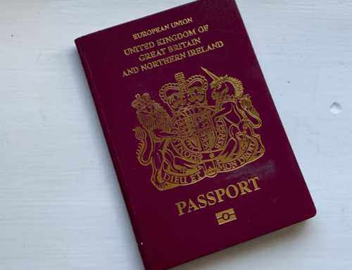
I recently returned to my home country after living abroad, and had to exchange my foreign driving licence. The form asked for the address on my last driving licence. A simple enough request, right? However, in the context of my situation, it wasn’t immediately clear whether this meant the last address on my licence in any country, or the last address on my licence in the country I was returning to. Given that I was still in possession of my foreign licence, the word “last” wasn’t entirely correct if referring to that. If the phrase “current or most recent” licence had been used, I would be sure how to answer. “Last” implies something that is consigned to the past, which would therefore refer to my last address before I left. An assumption which is strengthened by the request to provide a GB driver number (if known).
In addition, the notes indicated there was no fee for the type of licence exchange I was doing. Yet it did indicate a fee for providing a new picture, which appeared to be a necessity, as how would they get a picture for my new licence otherwise? The requirement in my particular scenario was not clarified, and asking other people about it didn’t draw any firmer conclusions, so it was up to me to gamble on whether or not to send payment.
At the time of writing, I have no idea whether I made the right calls on either of these matters!
Cluttered, hard-to-follow presentation
Public body forms have to cover a very wide range of potential information. This typically means including a lot of fields that are redundant for a lot of applicants. Instructional wording around this therefore needs to be crystal clear. And it needs to be assisted by good visual design.
When individual response fields or even entire sections can be skipped, a correctly completed form will look visually incomplete. With this, the applicant has no easy cues alerting them to anything they’ve missed. The more that needs to be skipped, the easier it is to miss mandatory fields.
Good design that “thinks along” with the applicant experience – UX design if you like – can go a long way to avoiding omissions, as well as confusion when unnecessary fields get filled in by mistake.
While online forms can be designed so that only relevant fields appear on-screen, paper forms with many possible fields are often over-crowded. In both cases, leaving more blank space will make forms appear less overwhelming, and allow better visibility of each important feature. More blank space will, of course, also make forms longer. But with good design, and good up-front explanation to set expectations, longer forms can be made to appear less daunting.
If the length of paper forms is determined by a requirement to minimise paper use, it’s worth remembering that one 5-page form uses less paper than two (or more) 3-page forms. Correct form-filling at the first attempt means less paper gets used.
When it comes to online forms, unnecessary fields can be hidden and prompts to complete any missing fields can be given. But that’s no excuse for design complacence. The technicalities that determine what an applicant can and must fill in must be appropriate for all eventualities, and constantly checked for correct behaviour. Especially after any updates are applied. Talking of which …
Disruptive updates
As information requirements change over time, so do questions on forms. But every updated, added or deleted question risks breaking the logic in another part of the form or its supporting guidance.
Even the most carefully and considerately designed forms can become unruly and unfit for purpose over the course of a few updates, with both wording and visual appearance taking the hit. For online forms, technical behaviour is an additional aspect that’s at-risk.
It may sound cumbersome, but reviewing the entire form and supporting guidance is a must every time updates are made.
Two tips for managing updates:
1) Every form, together with its supporting guidance, should be managed by a single “owner”. This person’s familiarity with the form as a whole should mean they’re more likely to know the knock-on effects of any adjustments.
2) Engage a complete outsider to review your forms and supporting guidance, as their lack of familiarity will help identify real-world user issues.
A problem that’s amplified in translation
If something is hard to understand in its original language, the problem is compounded in translation. Unclear instructions are even more confusing to those who are trying to navigate a form in a second language, or relying on official (or unofficial) translations.
Because languages don’t always translate directly to each other, a certain amount of adaptation is often needed. When the original version is less than perfect, these adaptations can easily go off at the wrong tangent.
Additionally, because form field labels can sometimes just be one or two words, the risk of being misinterpreted in translation is even higher.
Given that public bodies will always need to communicate with foreign nationals, ensuring original copy is clear, complete and unambiguous is vitally important. The better it does on these fronts, the higher the chances that automated translation tools will deliver correct results. But ideally, professional human translations into other languages should always be provided to avoid the risk of misunderstandings when applicants take matters into their own hands.
Another consideration on translated forms is salutations and address formats. These can be very different in different countries, and allowances need to be made if there is a situation whereby foreign addresses or salutations will be entered.
Translation can bring collateral benefits
Translations can expose ambiguities. Which means they also present opportunities to avoid them. A good (human) transcreator – that’s a translator who takes great care to also naturalise the translated language – will spot ambiguities, inconsistencies and incompatibilities during their process. Sometimes, engaging a professional transcreator is the key to knocking your original language version back into shape.
Conclusion
The more forms that get completed correctly first time, the less time is wasted on remedial administration. The clearer form instructions are, the less burden there is on helpdesks. All of which translates directly into financial savings.
And the benefits of properly worded, designed and maintained forms don’t stop there. A body that’s easy to work with is viewed more positively by its users. That means less frustration being vented at staff, which makes your organisation a more appealing place to work.
Need help getting on form with your forms?
I’m Miriam Young, a freelance senior copywriter and transcreator who can scrutinise your needs and materials, and help ensure your forms are fit for purpose.
My native language is English, and that’s the language I write in and transcreate to. Alongside this, my experience working with clients and team-mates from all around the world means I have full appreciation of what’s needed in international situations.
I do not provide graphic design services, but I can instruct a designer according to your requirements.